The beauty of good design is that
the work speaks for itself.
project spotlight on:
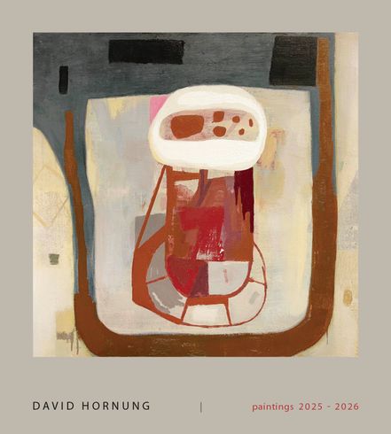
Artist/Educator, DAVID HORNUNG
A 128 page book form color master, artist David Hornung — 2025-2026 edition.
‘Throughout his career, the artist David Hornung has deeply explored the possibilities of planar picture-making across media, including painting, printmaking, textile, and mixed-media collage. This volume, focusing on his recent work in painting and especially collage, offers the occasion to consider these two veins of his work in dialogue. Immediately apparent are the commonalities, namely his sensitive relations of color across flat, mosaic-like compositions. And yet, each material presents its own advantages and constraints, as the artist himself has noted: “I think of them as separate activities, painting being ‘plastic’ and collage, constructed.”
Hornung’s paintings and collages differ, for one, in the nature of their gestures. In the paintings, his hand is discernible as line and surface texture, whereas his collages involve the semi-predictable expression of torn paper. Unlike the clean-cut shapes in, say, Matisse’s découpages, or Picasso’s cubistic collages, Hornung frequently favors a rended edge to a pristine one. The violent act of ripping is indeed a gesture of sorts, and may be used to simulate erratic energies, as do the jagged components of In Passing; an erosion from within a shape, as if it were eaten away by acid, like in the honey-colored cutout of Trellis; or as a formal device to juxtapose organic and synthetic bodies, as with the precarious scaffolding upholding the House of Mirth (all 2026). His edges are never just edges; the perimeters are, at once, evocative expressions of line.' — matt moment
See more design work for artists
here.